M24 Statistik 1: Wintersemester 23/24
Vorlesung 04: Darstellung von Daten
Health and Medical University Potsdam
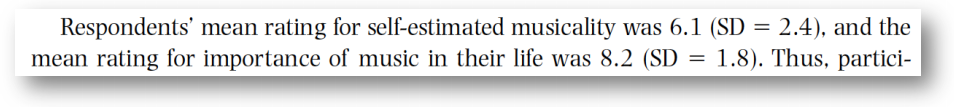
Angabe von Lage- und Streuungsmaßen in wissenschaftlichen Arbeiten
- Handelt es sich um einzelne Werte, können diese übersichtlich im Fließtext berichtet werden:
- Handelt es sich um eine größere Anzahl von Werten (z.B. bei mehreren Bedingungen) bietet sich eine Darstellung in Tabellenform an.
- Auch bei dieser Darstellung sollten Lage- und Streuungsmaße angegeben werden.
- In wissenschaftlichen Manuskripten werden Tabellen häufig nach den APA-Richtlinien (7. Edition, 2020) formatiert:


Siehe Link1 für Informationen zur Formatierung von Tabellen im APA-Stil
Beispieltabelle

Balkendiagramm mit Fehlerbalken
- Der Fehlerbalken ist die klassische Wahl zur Darstellung der Streuung von Daten.
- Die Ausdehnung des Fehlerbalkens entspricht dem Lagemaß (z.B. Mittelwert) plus/minus dem Streuungsmaß (z.B. Standardabweichung).
- Der gesamte Fehlerbalken hat also die Ausdehnung \(2\cdot\text{Streuungsmaß}\)

- Klassische Kombinationen von Lagemaß und Streuungsmaß sind:
- \(\text{Mittelwert}\pm\text{Standardabweichung}\)
- \(\text{Mittelwert}\pm\text{Standardfehler}\) (dazu kommen wir noch)
- \(\text{Mittelwert}\pm\text{Konfidenzintervall}\) (dazu kommen wir noch)
- \(\text{Median}\pm\text{IQR}\)
- \(\text{Median}\pm\text{Median-Abweichung}\) (das behandeln wir nicht)
Beispiel

Einzelner Punkt statt Balken
- Statt eines Balkens kann der Mittelwert auch durch einen einzelnen Punkt repräsentiert werden – manche empfinden das als eleganter:

The case against bar plots
- Trotz ihrer hohen Verbreitung haben Balkendiagramme (Barplots) eine Reihe von Nachteilen:
- Sie geben kaum Information über die spezifische Verteilung der Daten und mögliche Ausreißer
- Die intransparente Darstellungsweise verdeckt häufig, dass 1) Daten unrealistisch sind oder 2) Ausreißer das Lagemaß verzerren oder 3) die Verteilung der Daten unpassend für das verwendete Lagemaß sind.
- Sie legen den Fokus auf irrelevante Bereiche der Skala (siehe Abbildung unten)

Durch die tatsächliche Verteilung der Datenpunkte im rechten Plot wird klar, dass im Balkendiagramm ein vergleichsweise starker Fokus auf Bereiche gelegt wird, in den gar keine Daten enthalten sind (“Zone of Irrelevance”), und andererseits Extremwerte, insbesondere oberhalb des Fehlerbalkens, visuell völlig unrepräsentiert sind (“Zone of Invisibility”). Der Fehlerbalken ist außerdem leicht mit der Illusion verbunden, dass sich alle Datenpunkte innerhalb des angezeigten Bereiches befinden (“Within-the-bar bias”).2.
The case against bar plots
- Alle Datenverteilungen haben den gleichen Mittelwert und Standardabweichung

The case against bar plots

Der Box-Plot
- Eine bekannte Darstellungsform für den Median ist der Boxplot
- In einer gängigen Variante zeigt der Boxplot drei Informationen an:
- Median (als einfache Linie)
- Box: die “mittleren 50% der Daten” (25% über dem Median, 25% unter dem Median)
- Antennen (“Whiskers”): zeigen Grenzen der Ausreißer-Definition an (Ausreißer = alle Punkte unter- und überhalb der Antennen). Häufig ist hier das Kriterium, dass die Daten im Bereich \([Q_1-1.5\cdot IQR; Q_3+1.5\cdot IQR]\) liegen müssen.
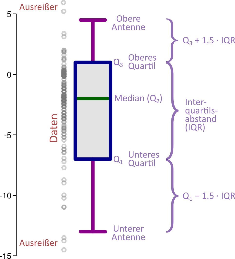
- Der Boxplot gibt eine schnelle Übersicht über wesentliche Kennwerte eines Datensatzen
- Zu beachten ist, dass zahlreiche Varianten des Boxplots existieren
- Bei einer weiteren häufigen Variante zeigen die Antennen das absolute Maximum und Minimum der Daten an (also inklusive möglicher Ausreißer)
Moderne Darstellungsformen


- Moderne Statistik- und Plotsoftware ermöglicht heutzutage eine verbesserte und transparentere Darstellung von Daten:
- Anzeige einzelner Datenpunkte, meist getrennt durch “Jitter” (d.h. leichte horizontale oder vertikale Versetzung mit zufälligen Abständen, um Überschneidung der Datenpunkte zu reduzieren)
- Anzeige der Verteilung mittels (interpolierter) Histogramme (wichtige Information für die
Auswahl geeigneter Lage- und Streumaße, aber auch statistischer Tests) - Zusätzliche Anzeige von Kennwerten
Abschneiden der y-Achse
- Das Abschneiden der y-Achse verzerrt häufig die Stärke von Effekten.

- Die grundsätzliche Empfehlung ist daher, die y-Achse bei 0 beginnen zu lassen.
- Es gibt aber Ausnahmen:
- Vorliegen eines anderen natürlichen Referenzwertes (z.B. IQ-Wert 100, wenn alle Werte über 100 liegen).
- Wären tatsächlich vorhandene Unterschiede zwischen Balken verschiedener Bedingungen überhaupt nicht mehr wahrnehmbar, kann ein Abschneiden der y-Achse sinnvoll sein (oder eine Logarithmus-Skala!).
- In manchen Fällen können Messwerte niemals unter einen Mindestwert fallen. Beispielsweise sind motorische Reaktionszeiten physiologisch bedingt fast immer über 100ms – in diesem Fall ist der Bereich
0-100ms “Totraum” und kann sinnvollerweise weggelassen werden. - Im Idealfall wird das Abschneiden der y-Achse durch einen “Bruch” angezeigt (siehe nächste Folie).
Beispiel für gebrochene y-Achse

Worst plot ever


Empirische Verteilungen
- Eine Häufigkeitsverteilung oder auch kurz Verteilung gibt zu verschiedenen Werten eines Merkmals an, wie häufig dieser Wert vorkommt.
- Die Häufigkeit kann entweder als absolute oder relative Häufigkeit angegeben werden.

- Empirische Verteilungen geben an, wie die tatsächlich gemessenen Daten einer Stichprobe verteilt sind. Das AirBnB-Beispiel zeigt empirische Verteilungen.
- Theoretische Verteilungen sind durch eine Funktion definiert, die die Verteilung von Daten mathematisch beschreibt.
- Im Gegensatz zu empirischen Verteilungen geben theoretische Verteilungen die (erwartete) Häufigkeit zu jedem möglichen Wert des Merkmals an.
Normalverteilung
- Eine der wichtigsten theoretischen Verteilungen in der Psychologie ist die Normalverteilung (auch Gauß-Verteilung).
- Aufgrund ihrer Form wird sie umgangssprachlich auch als Glockenkurve bezeichnet.
- Mathematische Definition:
\[ f(x) = \frac{1}{\sigma\sqrt{2\pi}}e^{-\frac{1}{2}\left(\frac{x-\mu}{\sigma}\right)^2} \]

- \(\mu\) kennzeichnet den Mittelwert und \(\sigma\) die Standardabweichung der Verteilung.

Zur Wiederholung: müssen statistische Kennwerte wie Mittelwert und Standardabweichung nicht aus Stichproben geschätzt werden, sondern sind als bekannt angenommen, werden sie häufig mit griechischen Buchstaben bezeichnet.
\[ \bar{x} \longrightarrow \mu \\ s \longrightarrow \sigma \]
- Die Konstante \(\frac{1}{\sigma\sqrt{2\pi}}\) sorgt dafür, dass die Fläche unter der Verteilung gleich 1 ist.
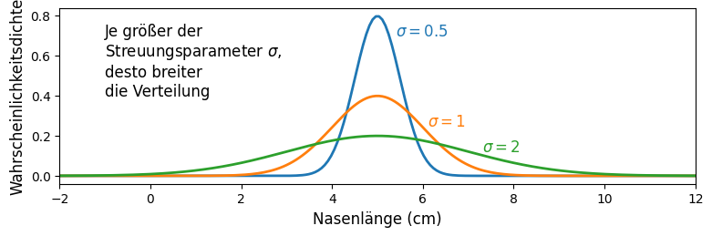
Normalverteilung: die Parameter \(\mu\) und \(\sigma\)
- Die Parameter \(\mu\) und \(\sigma\) sind die Formparameter (engl. shape parameter) der Normalverteilung — mit diesen zwei Parametern ist die Verteilung eindeutig definiert.
- Als Lageparameter verschiebt \(\mu\) die Verteilung auf der x-Achse:

- Als Streuungsparameter verändert \(\sigma\) die Breite der Verteilung:
Was ist “normal” an der Normalverteilung bzw. warum ist die Normalverteilung so häufig?
- Auch wenn die Historie des Terms Normalverteilung umstritten ist10 bringt er zum Ausdruck, dass es sich um eine empirisch sehr häufig beobachtete Verteilung handelt.
- Die Erklärung für die Häufigkeit der Normalverteilung liefert der zentrale Grenzwertsatz:
 |
Zentraler Grenzwertsatz: bei einer additiven Überlagerung vieler kleiner unabhängiger Zufallseffekte zu einer aggregierten Zufallsvariable \(Z\), nähert sich für \(n\rightarrow\infty\) die Verteilung von \(Z\) der Normalverteilung an. (Beweis11 — kein Klausurstoff) |
- Fast alle psychologischen Phänomene sind Ausdruck einer Überlagerung vieler kleiner Zufallseffekte:
- Genetische Zufallseffekte
- Entwicklungsbiologische Zufallseffekte (z.B. im Mutterleib)
- Zufällige Umwelteinflüsse (Familie, sozialer Kontext, Klima)
- Auch Messfehler wären ein solcher Zufallseffekt — gleichzeitig sind Verteilungen in der Psychologie aufgrund der genannten Effekte auch ohne Messfehler häufig normalverteilt.
- Obwohl die Vielzahl der Zufallseffekte Vorhersagen in der Psychologie enorm erschwert, haben sie aus statistischer Sicht auch einen Vorteil: wir können häufig (nicht immer!) annehmen, dass psychologische Merkmale einer Normalverteilung in der Bevölkerung folgen.
Normalverteilungen in freier Wildbahn


Eine kurze Geschichte der Normalverteilung
- Die Normalverteilung wurde mehrmals, zum Teil unabhängig, und für verschiedene Zwecke hergeleitet.
- Die erste Herleitung der Normalverteilung stammt aus dem Jahr 1733 von Abraham de Moivre, der nach einer Approximationsfunktion für die Binomialverteilung \(f(k)=\frac{n!}{k!(n-k)!}p^k(1-p)^{n-k}\) suchte, da ihm die Berechnung der Fakultäten (z.B. \(n!\)) bei großen Zahlen mühselig wurde.
- Tatsächlich ist diese Herleitung bereits ein Spezialfall des zentralen Grenzwertsatzes, da die Summe von binären Zufallsvariablen behandelt wird (z.B. wie oft “Kopf” bei “Kopf oder Zahl”).
- Link zu einer Herleitung12
- Der zentrale Grenzwertsatz in seiner allgemeinen Form (beliebige Verteilungen) wurde 1778 von Pierre-Simon Laplace hergeleitet.
- Link zu einer Herleitung13
- Im Jahr 1808 gelang Robert Adrain der Nachweis, dass die Normalverteilung eine valide Beschreibung von zufälligen Messfehlern ist.


Eine kurze Geschichte der Normalverteilung
- Erst im Jahr 1809 tritt Carl Friedrich Gauß auf die Bildfläche und erbringt ebenfalls den Beweis für die Allgemeingültigkeit der Normalverteilung für Messfehler (daher wird die Normalverteilung auch zuweilen Fehlergesetz genannt).

- Ein wichtige Motivation für Gauß’ Arbeit an Fehlerverteilungen waren astronomische Messungen, die häufig ungenau waren und viele Messwiederholungen erforderten. Eine zentrale Frage war: welcher Geseztmäßigkeit folgen diese Messfehler?
- Der Beweis von Gauß war von besonderer Eleganz und basierte auf drei Annahmen:
- Messfehler sind symmetrisch (Fehler in -X und +X Richtung sind gleich wahrscheinlich)
- Kleinere Fehler sind häufiger als größere Fehler
- Der Mittelwert ist der beste Schätzer für den Lageparameter der wahren theoretischen Verteilung, oder anders gesagt: der beste Schätzer für die unbekannten Fehler \(x_i - \mu\) (\(\mu\) ist nicht bekannt!) ist \(x_i - \bar{x}\).
- Mit diesen wenigen Annahmen konnte Gauß zeigen, dass die Funktion die mit größter Wahrscheinlichkeit Fehler dieser Art erzeugt14, die Normalverteilung ist. Herleitung15
- Eine heute populäre und intuitive Herleitung basiert auf einem Gedankenexperiment, in dem Würfe von Dartpfeilen auf ein Bull’s Eye betrachtet werden, wobei Wurffehler in x- und y-Richtung als unabhängig angenommen werden. Sie geht auf John Herschel (1850) zurück. Instruktives Video zur Herleitung16

Charakteristiken von Verteilungen
Vorschau: p-Wert
- In Ihren Übungen mit JASP wird Ihnen u.U. ein Wert bereits jetzt begegnen: der p-Wert
- Der p-Wert ist von zentraler Bedeutung in der psychologischen Forschungsliteratur (for the better or the worse).
- Der p-Wert ist ein Signifikanz-Maß: er gibt vereinfacht gesprochen einen Hinweis darauf, wie wahrscheinlich es ist, dass ein gefundener Effekt (z.B. Mittelwertsunterschied zwischen zwei Gruppen) auf bloßem Zufall basiert.
- Je kleiner der p-Wert, desto höher die statistische Signifikanz, desto sicherer können wir uns also sein, dass ein Effekt nicht nur auf einer zufälligen Schwankung von Messfehlern basiert.
- Als Konvention hat sich etabliert, dass bei p-Werten kleiner 0,05 Effekte als statistisch signifikant gewertet werden.
- Den p-Wert werden wir noch ausführlich in den Vorlesungen zur Inferenzstatistik behandeln.

![]()
Fußnoten
https://apastyle.apa.org/style-grammar-guidelines/tables-figures/tables
Weissgerber TL, Winham SJ, Heinzen EP, Milin-Lazovic JS, Garcia-Valencia O, Bukumiric Z, Savic MD, Garovic VD, Milic NM (2019) Reveal, Don’t Conceal: Transforming Data Visualization to Improve Transparency. Circulation 140:1506–1518.
https://www.biztory.com/blog/bar-charts-the-good-the-bad-and-the-ugly
https://blog.revolutionanalytics.com/2017/05/the-datasaurus-dozen.html
https://jasp-stats.org/2021/10/05/raincloud-plots-innovative-data-visualizations-in-jasp/
https://jasp-stats.org/2021/10/05/raincloud-plots-innovative-data-visualizations-in-jasp/
https://support.goldensoftware.com/hc/en-us/articles/360019762133-Using-Break-Axis-in-Grapher
https://twitter.com/jonatanpallesen/status/1694966308465439117
https://twitter.com/jonatanpallesen/status/1694966308465439117
https://stats.stackexchange.com/questions/430621/why-is-the-normal-distribution-called-normal
https://alanhdu.github.io/posts/2019-10-21-normal-distribution-derivation/
http://www.stat.yale.edu/~pollard/Courses/241.fall2014/notes2014/Bin.Normal.pdf
https://towardsdatascience.com/central-limit-theorem-proofs-actually-working-through-the-math-a994cd582b33
In diesem Kontext erfand Gauß direkt auch das Prinzip der Maximum-Likelihood-Schätzung
https://notarocketscientist.xyz/posts/2023-01-27-how-gauss-derived-the-normal-distribution/
https://www.youtube.com/watch?v=cy8r7WSuT1I
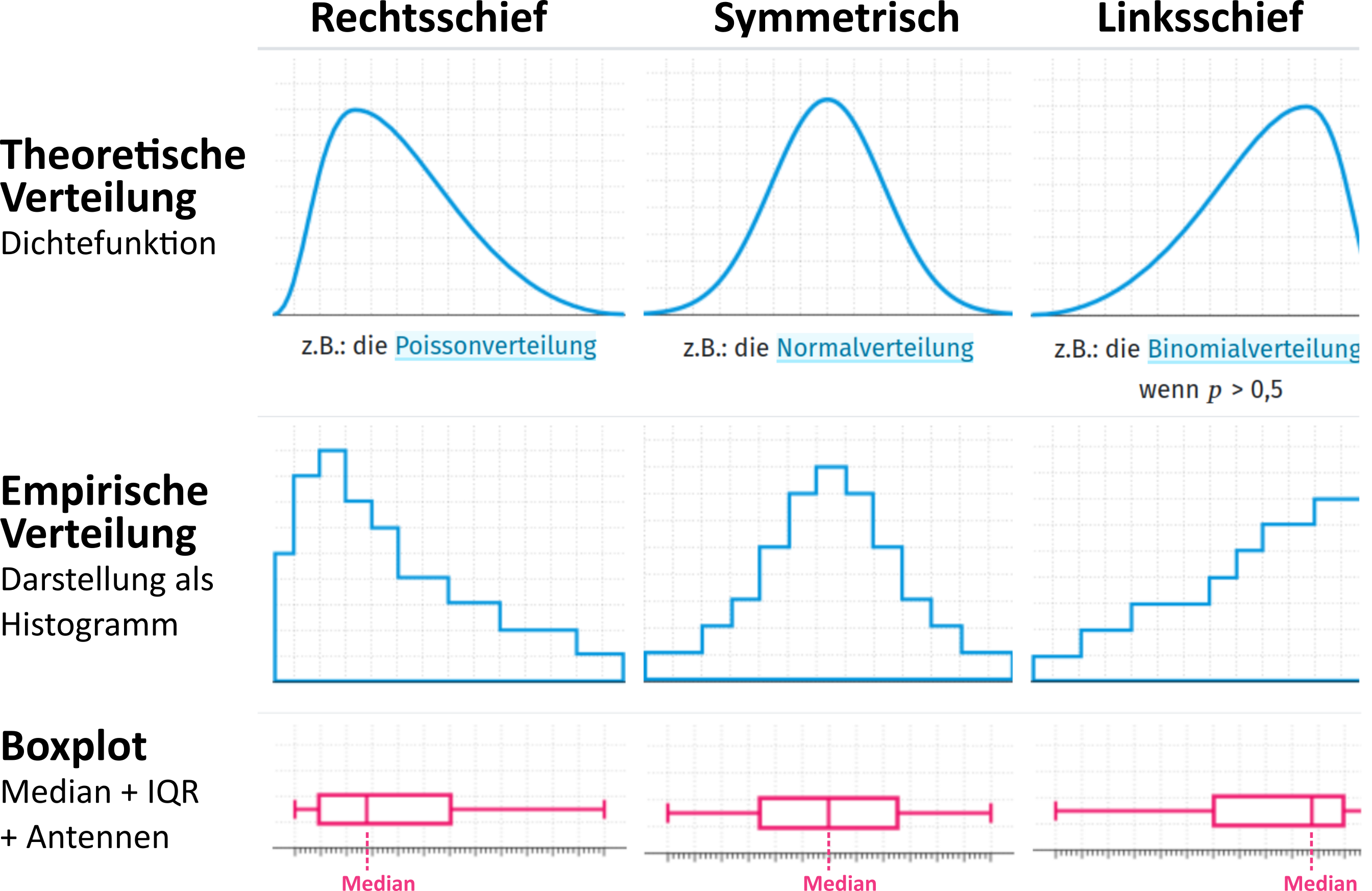
https://matheguru.com/stochastik/schiefe-linksschief-rechtsschief-symmetrisch.html